Metal Reviews

Newest and Best Metal Reviews!
FAQ :: Search :: Members :: Groups :: Register
Login
It is currently Sat Jul 05, 2025 8:36 pm


Post new topic Reply to topic  [ 63 posts ]  Go to page 1, 2, 3, 4  Next   
Author Message
 Post subject: METAL ARTWORK RETURNS!!!
PostPosted: Tue Mar 07, 2006 11:49 am 
Offline
Metal Lord

Joined: Fri Dec 30, 2005 2:48 am
Posts: 738
Location: Denver, Co. U.S.A.
Image

I tried posting this in the metal artwork forum, but evidently the solitary artist that was posting there had an emotional breakdown and now it's all locked up. So I said what the hell, and dug up this idea I had for my for friends band that never saw the light of day. Unfortunately, I have been having problems with photobucket so this was the largest I could get the image to be. Maybe I can get the original file hosted somewhere and then you could see it better.

The name of the band is "Of Winds and Faint Echoes" (yes, a bit odd I know). You can't really see the name very well on the cover, but it doesn't really matter, since they had to break up later on. (They had all their equipment stolen, as well as some other set backs) So I am just posting this for fun. They had a demo recorded and I told my friend (the keyboard player) that I wanted to make something for it. I don't think the other members ever even saw it.

But anyway, this was the very first photoshop project I had ever done, so it is fairly simple. It was all a matter of cutting and pasting and adding effects. But make no mistake, alot of work was involved as I had to deal with very low quality images taken from live shows. Every single skull was hand picked out of existing images and colored just the way I wanted it, which took quite a while to complete. My goal was simply to capture the energy these guys played with. Whereas most bad photos are usually just of a bunch of jerk offs standing around, I wanted something with motion and vitality. I suppose the skulls and roses are a bit cliche' but it was just for fun as I said. Over all I am very happy with how it turned out.

The real shame of it is, these guys are all very talented, and it's too bad this didn't get to go somewhere, although who knows what could happen down the road. Here are two parts of one song recorded live in 2004. The quality is not the best, but you can still hear what is going on and see the amazing guitar work. These guys can shred in their sleep.

part 1 http://www.rockdenver.com/videop.php?id=248
part 2 http://www.rockdenver.com/videop.php?id=247

I recommend opening these in Internet Explorer as I had trouble with Firefox.


Top
 Profile  
 
 Post subject:
PostPosted: Tue Mar 07, 2006 12:40 pm 
It beats most of the works in the Metal Artwork forum single-handedly. That doesn't say I particularly like it, though - probably because all the band members look gay.


Top
  
 
 Post subject:
PostPosted: Tue Mar 07, 2006 1:46 pm 
Offline
Ist Krieg
User avatar

Joined: Fri Mar 18, 2005 1:24 am
Posts: 8992
Location: Husker Nation
Yeah, I don't like it either. The colors are so damn bright and the band just looks, well, gay.


Top
 Profile  
 
 Post subject:
PostPosted: Tue Mar 07, 2006 1:56 pm 
Offline
MetalReviews Staff
User avatar

Joined: Mon Jan 31, 2005 4:58 pm
Posts: 1999
Location: Frownland
nah, it's pretty good. more than what's necessary for a demo cover.

and they don't look gay, they look passionate! now if they were standing around playing their instruments while looking away, and not showing the slightest indication of enjoying themselves like an 80s new wave act.. that would be gay. as it is they look like a band.


Top
 Profile  
 
 Post subject:
PostPosted: Tue Mar 07, 2006 2:03 pm 
Offline
Ist Krieg
User avatar

Joined: Fri Mar 18, 2005 1:24 am
Posts: 8992
Location: Husker Nation
lizardtail wrote:
nah, it's pretty good. more than what's necessary for a demo cover.

and they don't look gay, they look passionate! now if they were standing around playing their instruments while looking away, and not showing the slightest indication of enjoying themselves like an 80s new wave act.. that would be gay. as it is they look like a band.


I don't agree. They should be on the back of the jewel case if not on it at all. 80's new wave? Who are you referring to?


Top
 Profile  
 
 Post subject:
PostPosted: Tue Mar 07, 2006 2:06 pm 
Offline
Metal King
User avatar

Joined: Wed Aug 24, 2005 8:20 pm
Posts: 812
Location: Somewhere between slightly irritated and really pissed off...
Nice job on the Opeth font... :P


Top
 Profile  
 
 Post subject:
PostPosted: Tue Mar 07, 2006 4:15 pm 
Offline
MetalReviews Staff
User avatar

Joined: Thu Apr 14, 2005 10:10 pm
Posts: 2007
Location: My sickbed.
I'm not a fan of the composition. It looks too randomly jumbled together.


Top
 Profile  
 
 Post subject:
PostPosted: Tue Mar 07, 2006 6:14 pm 
Offline
MetalReviews Staff
User avatar

Joined: Wed Feb 09, 2005 4:02 pm
Posts: 29896
Location: UK
metalNESS wrote:
lizardtail wrote:
nah, it's pretty good. more than what's necessary for a demo cover.

and they don't look gay, they look passionate! now if they were standing around playing their instruments while looking away, and not showing the slightest indication of enjoying themselves like an 80s new wave act.. that would be gay. as it is they look like a band.


I don't agree. They should be on the back of the jewel case if not on it at all. 80's new wave? Who are you referring to?

Agreed about the band members being on the back, or the inside, that would be a great old-school pic. And it does look a bit cluttered...


Top
 Profile  
 
 Post subject:
PostPosted: Tue Mar 07, 2006 6:15 pm 
Here's some work I've done for bands (not all metal, sorry):

Image

Image

Image

Image

Image

Image

Image

Image


Top
  
 
 Post subject:
PostPosted: Tue Mar 07, 2006 6:20 pm 
Offline
MetalReviews Staff
User avatar

Joined: Wed Feb 09, 2005 4:02 pm
Posts: 29896
Location: UK
Eyesore wrote:
Here's some work I've done for bands (not all metal, sorry):

]


The first two are especially good.

And what's the latest with Chris and the official art forum? I haven't heard from him in a long time, does he still work in that area? Has he visited the site recently, even, or did me and Skullthrone scare him off for good?


Top
 Profile  
 
 Post subject:
PostPosted: Tue Mar 07, 2006 7:26 pm 
Offline
Sailor Man
User avatar

Joined: Tue Jan 11, 2005 9:00 pm
Posts: 6179
Location: Italiae
Zad wrote:
Eyesore wrote:
Here's some work I've done for bands (not all metal, sorry):

]


The first two are especially good.

And what's the latest with Chris and the official art forum? I haven't heard from him in a long time, does he still work in that area? Has he visited the site recently, even, or did me and Skullthrone scare him off for good?


I think he got mad at you Zad.


Top
 Profile  
 
 Post subject:
PostPosted: Tue Mar 07, 2006 7:29 pm 
Offline
MetalReviews Staff
User avatar

Joined: Wed Feb 09, 2005 4:02 pm
Posts: 29896
Location: UK
Dago wrote:
Zad wrote:
Eyesore wrote:
Here's some work I've done for bands (not all metal, sorry):

]


The first two are especially good.

And what's the latest with Chris and the official art forum? I haven't heard from him in a long time, does he still work in that area? Has he visited the site recently, even, or did me and Skullthrone scare him off for good?


I think he got mad at you Zad.


He may have done at the time, but soon after we apologised to each other and made up. Nothing to do with me...


Top
 Profile  
 
 Post subject:
PostPosted: Tue Mar 07, 2006 7:42 pm 
Offline
Ist Krieg
User avatar

Joined: Sat Feb 12, 2005 9:26 pm
Posts: 6810
Location: lolchair
Eyesore wrote:

Image


I'd hit it.


Top
 Profile  
 
 Post subject:
PostPosted: Tue Mar 07, 2006 8:13 pm 
Offline
Metal King
User avatar

Joined: Wed Aug 24, 2005 8:20 pm
Posts: 812
Location: Somewhere between slightly irritated and really pissed off...
@ Eyesore: Wow! The two first ones (especially no. 1) are pretty cool..


@ Kathaarian: So is your signature :lol:


Top
 Profile  
 
 Post subject:
PostPosted: Tue Mar 07, 2006 10:10 pm 
EisenFaust wrote:
@ Eyesore: Wow! The two first ones (especially no. 1) are pretty cool..

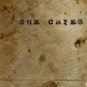
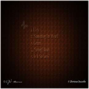
Unfortunately none of these but the She Cries cover—which is my project—were used by anyone. I've had bad luck with album designs.

The badkarma album was a done deal, I forget which they chose (I have another one that was just black with the band name), but I did that right before I got out of the Air Force in 2002. I shipped all my shit back to the states, computer included. The band found out someone owned the trademark to badkarma and they had to change their band name, they couldn't get a hold of me because I was without a PC. They changed their name to Lowbuz and had to have someone else do their cover, which became this (not nearly as cool as mine, very generic):

Image

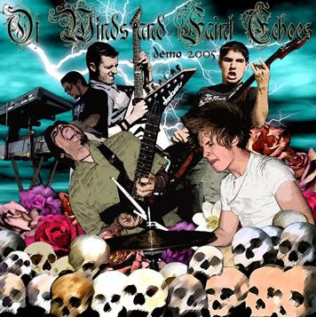
Rex Manning Day was a band my friend was producing and eventually ended up playing drums on. I was releasing this album on Good Pig Bad Pig Records, my label. I was giving the band $1000 toward the manufacturing of the CD, I was doing this basically for my friend since he was producing it and wanted to have a product to show people. Plus they weren't half bad for a punk band in the Air Force. Anyway, I designed a bunch of cool covers, but the band kept sending me fucking horrible artwork saying "can we use this?" and I'd be like, "NO! This sucks." I know it was their album, but I was giving $1000 and it was my name/label on the product, so...NO! I wasn't putting anything out with my name on it that looked like these (actual pictures the band wanted to use):

Image Image
Image Image

After I said no, they got pissed. I said get your own money, then, they designed their own artwork (the one with the cat...WHAT!?!?) and released it on CDR. Hahahaha. Retards. To see those other pics in their fully-detailed glory, click HERE, HERE and HERE.

Anyway, the Charmaine artwork was another artist my friend was working with. Basically the same scenario as with Rex Manning Day, but she liked the artwork. We got to the point of submitting everything to the manufacturer, but then she disappeared. It turns out she skipped town with some loser boyfriend, moved to North Carolina and that's the last we heard from her. Fucking weird. She was talented, too. Good thing we never paid for the CDs.

So, as you can see...my luck with designing band artwork flat out sucks. :cry:


Top
  
 
 Post subject:
PostPosted: Wed Mar 08, 2006 8:01 am 
Offline
Metal Lord

Joined: Fri Dec 30, 2005 2:48 am
Posts: 738
Location: Denver, Co. U.S.A.
Quote:
nah, it's pretty good. more than what's necessary for a demo cover.

and they don't look gay, they look passionate! now if they were standing around playing their instruments while looking away, and not showing the slightest indication of enjoying themselves like an 80s new wave act.. that would be gay. as it is they look like a band.


Thanks Lizardtail, at least one of you is not hopped up on crack. I'm a little mystified by the "gay" comments. I can't for the life of me figure out what they are doing that is homosexual. Luckily, I have a small army of "gay experts" at my disposal to help me sort this all out. Thanks guys.

Quote:
I don't agree. They should be on the back of the jewel case if not on it at all. 80's new wave? Who are you referring to?


Ok metalNESS, let me explain. THIS is 80s new wave.

Image

In case you have never met any Emo kids, this is The Cure, and their band photo exemplifies everything I was trying to change with my cover. But like I said, I was never actually working with the band, just something I spent countless hours on because I loved their music. It was very much thrown together because of what I had to work with. Though it never amounted to much, it was because of this cover that I met Dustin, the ex drummer of Throcult. (now playing guitar in Gematria) He did the print work for me at Kinkos, and noticed the Jackson guitars in the cover.

"Hey is this a metal band?"

We've been friends ever since.

Oh yea that brings me to the next point. Did any of you check out the video footage? Doesn't seem like it. No from the looks of things most of you just glanced at the image, skipped what I wrote and proceeded to post the first sentence that popped into your little heads. (as usual) Anyway, hopefully some more people will post some artwork as well now, since that chris guy got scared away.

P.S. Eyesore, good work man, I think I have seen some of these at Bed Bath and Beyond.


Top
 Profile  
 
 Post subject:
PostPosted: Wed Mar 08, 2006 9:08 am 
Arthur wrote:
P.S. Eyesore, good work man, I think I have seen some of these at Bed Bath and Beyond.

Are you sure you're not on crack? Haha. I told you it wasn't metal.

By the way, I actually like your cover artwork, but I dislike the "Demo 2005" part. I'm all about symmetry when needed and that shit needs to be centered! Hahaha. I would also suggest in the future to rely less on the filters as is, meaning you click them and leave them as is, or just adjust them a little. The filters are best utilized in conjunction with other filters and tricks. It works on the skulls, though, I think, but not on the band members.

If anyone needs some Photoshop tips, go here: http://www.good-tutorials.com (killer website)


Top
  
 
 Post subject:
PostPosted: Wed Mar 08, 2006 10:39 am 
Offline
Metal Lord

Joined: Fri Dec 30, 2005 2:48 am
Posts: 738
Location: Denver, Co. U.S.A.
heh just messin with ya. Well I can't center the demo thingy becaues then it would be over the dude and you couldn't see it. The reason I filtered the band members is because the pics were so blurry and low quality there was no choice. But c'mon they aren't THAT filtered. Just a touch of poster edges.


Top
 Profile  
 
 Post subject:
PostPosted: Wed Mar 08, 2006 5:42 pm 
Arthur wrote:
heh just messin with ya. Well I can't center the demo thingy becaues then it would be over the dude and you couldn't see it. The reason I filtered the band members is because the pics were so blurry and low quality there was no choice. But c'mon they aren't THAT filtered. Just a touch of poster edges.

I hate that filter! Haha. You see that cat pic that Rex Manning Day used? Maybe that's where my gatred stems from? Haha.

Anyway, I would have centered "Demo 2005" at the bottom with the skulls.


Top
  
 
 Post subject:
PostPosted: Wed Mar 08, 2006 8:16 pm 
Image

some silly artwork for a doom compilation Dee (Lizardtail) made for me... 8)

NP
Dee's Audio Guide to Quality Doom


Top
  
 
Display posts from previous:  Sort by  
Post new topic Reply to topic  [ 63 posts ]  Go to page 1, 2, 3, 4  Next   


Who is online

Users browsing this forum: Majestic-12 [Bot] and 14 guests


You cannot post new topics in this forum
You cannot reply to topics in this forum
You cannot edit your posts in this forum
You cannot delete your posts in this forum
You cannot post attachments in this forum

Search for:
Jump to:  
Powered by phpBB © 2000, 2002, 2005, 2007 phpBB Group